Countingup branding
The Countingup brand is the first brand to recognise that entrepreneurial businesses are after a company that keeps their accounting and banking needs in one area so they can concentrate on getting on with building their empire and handling the fun bits of running a business.
With this nurturing insight being the core goal of the company, it was important to communicate that they understand their target market’s enthusiastic personality and that they are a dependable match for them.
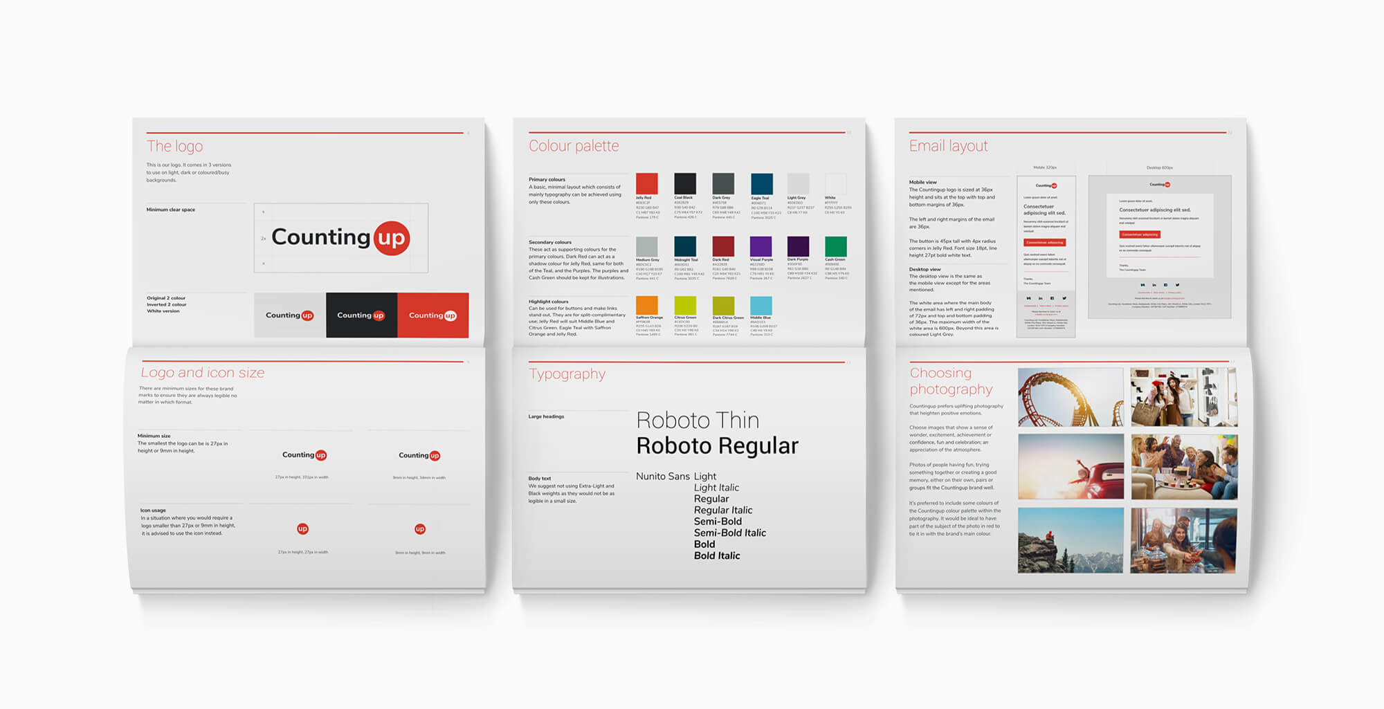
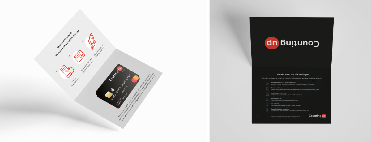
A warm red was chosen as the main brand colour to emphasise the brand’s boldness and practicality.
Countingup uses 2 typefaces. Roboto Thin played an important role to balance this aggressive and energetic colour through the use of it’s delicate, rounded shapes to symbolise Countingup’s meticulous attention to detail. Nunito Sans was designed to be highly legible even when the size of the text is small. It was chosen to reinforce the clean, no-nonsense, yet empathetic aesthetic.
The Countingup brand identity also features a lot of large red or white spaces, large blurry drop shadows and line-art icons. To ensure that these elements are consistent throughout the brand, a complete styleguide was created to demonstrate and explain the significance of the design elements.
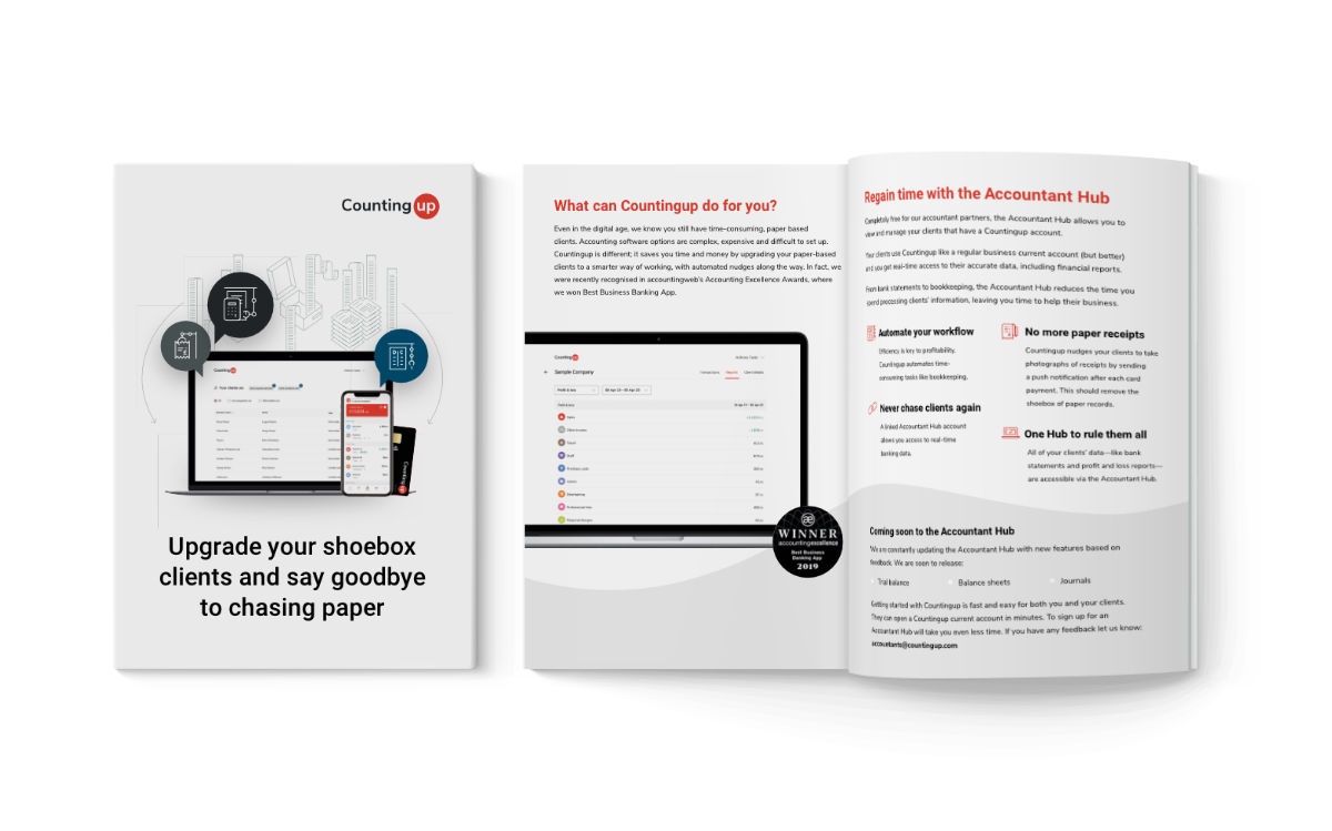
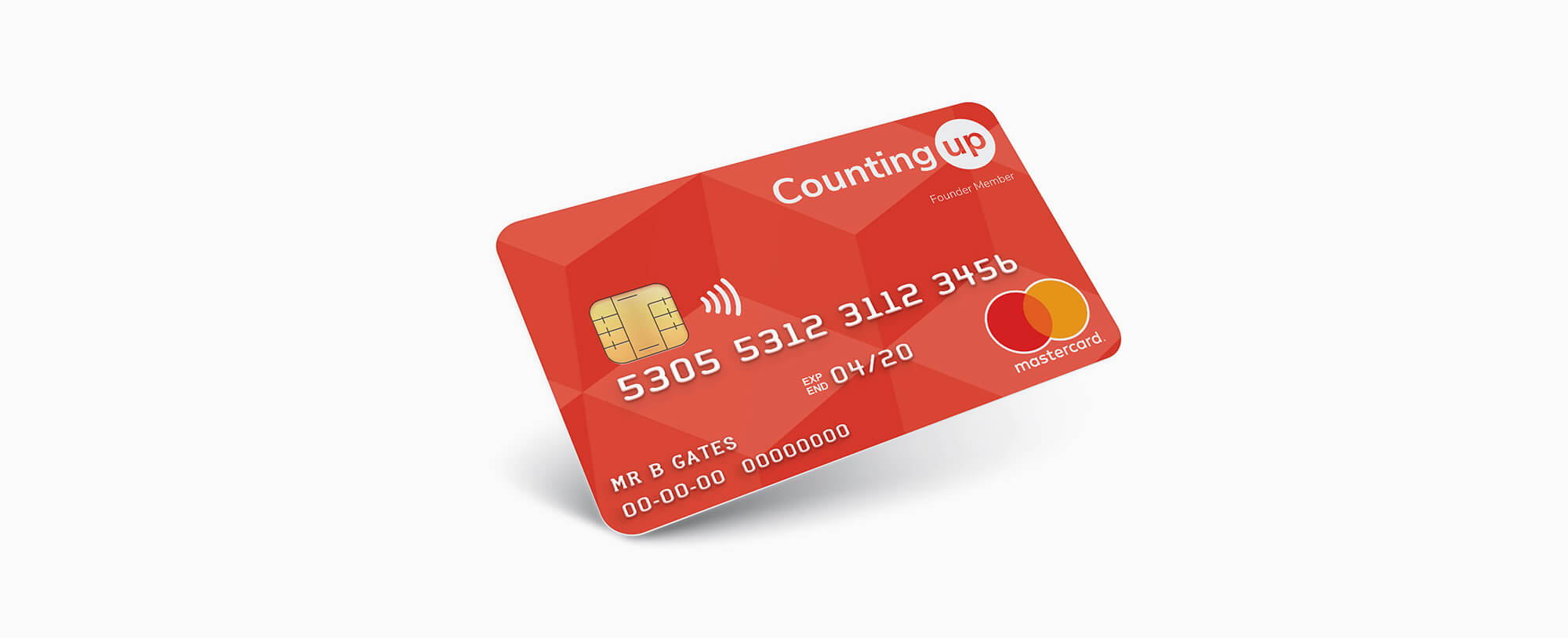
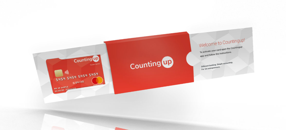
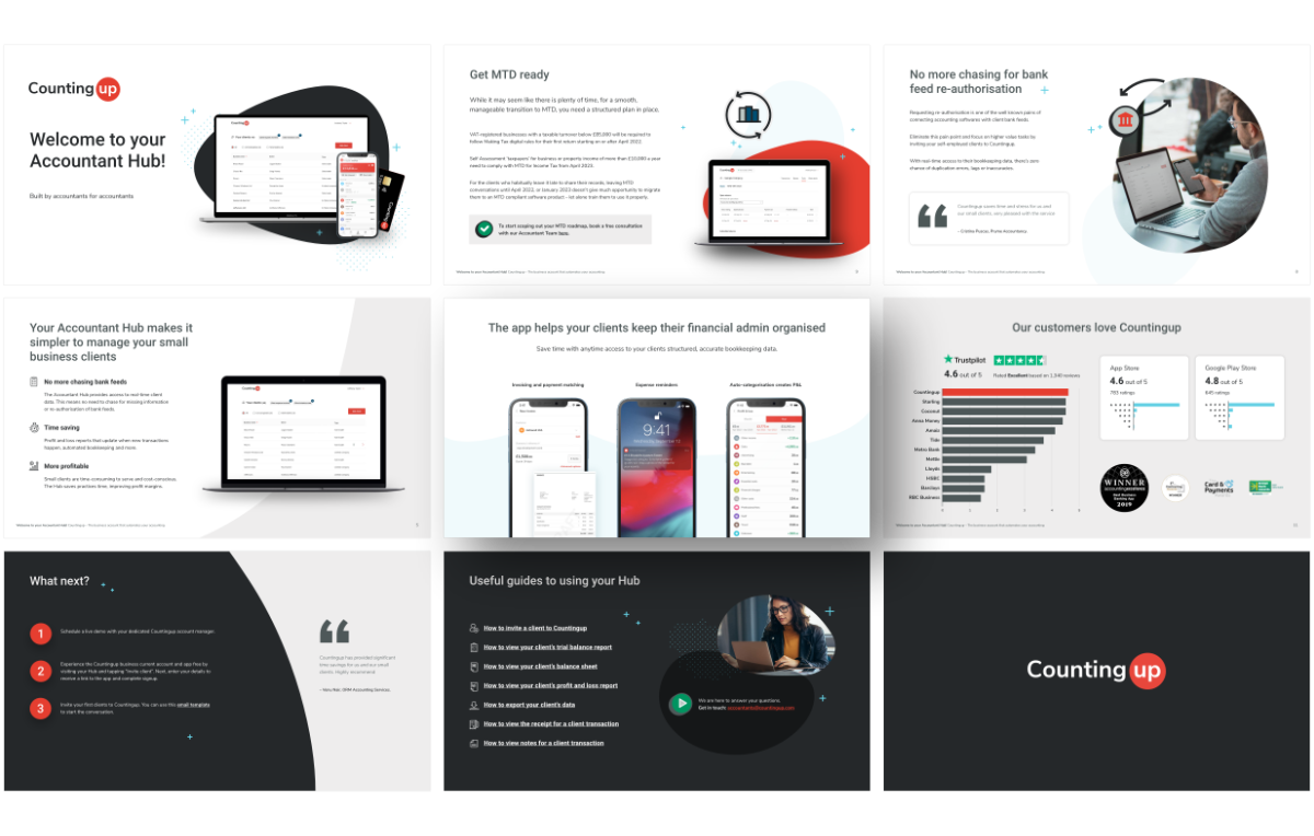
The brand identity is translated into the company logo, presentation decks, direct mail material, business cards, website, and the Mastercard product and its packaging.
The entire brand image intentionally highlights the company’s values as an energetic, empathetic and trustworthy business.
Customer: Counting ltd
Categories : branding, graphics, print, web
Skills : artworking, styleguide, Google Doc templates, graphics, front-end development


