DanOps
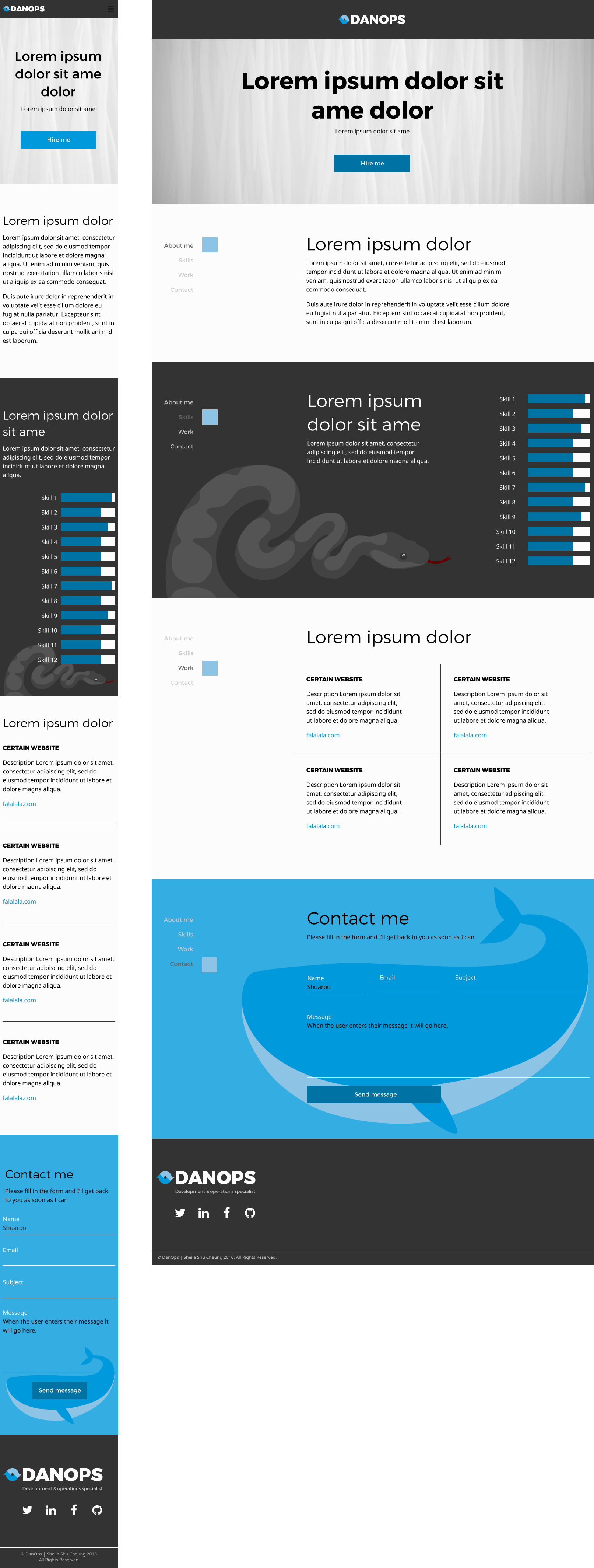
Logo for DanOps; a play on the Agile Development role, DevOps. DanOps is Daniel Burnley’s consultation company to offer his full-stack development and operations expertise. A logo and a responsive single-page website was designed for the DanOps brand.
The icon in the logo aims to represent the duality of the DevOps role and Agile’s cyclical nature.
Customer: DanOps
Categories : graphics, UX, web
Skills : graphics, UX, illustration, responsive web design


